a-typical
Identity for an Epilepsy Blog
Categorised in: Brand Identity, Design
A-typical is an epilepsy focused blog run from the Netherlands. Annelon’s inspiration to start a blog came from her experience with epilepsy which she has lived with her entire life. Her main goal is to share her experience with others and educate people with the knowledge she has collected.
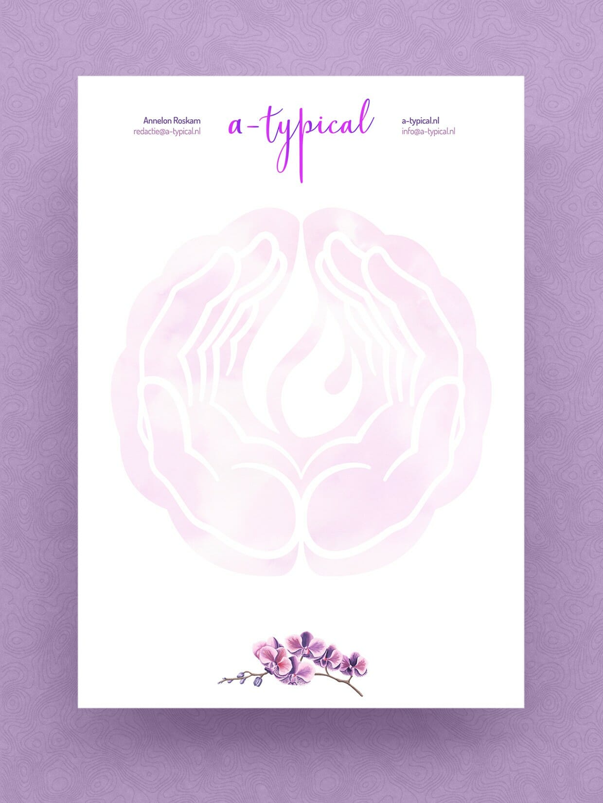
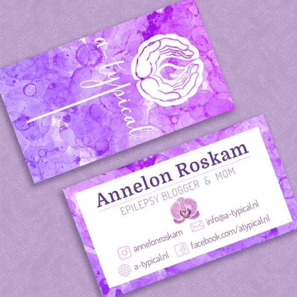
The logo came together by introducing several symbols associated with epilepsy. The brain which is the central point in epilpsy is used as the base for the logo, of which the two hemispheres are split by the palms and the tip of the flame. The flame is used to signify hope in reference to a beacon of light. The hands which are fostering the flame represents the care an individual with epilepsy takes in keeping their wellbeing and hope alive. A whimsical font was used to inspire joy and happiness with its movement and fluidity. The letter ‘p’ in a-typical was carefuly centered under the emblem to capture the image of a brain or flower stem. The colour purple is also internationally used for representing epilepsy.
The business cards where inspired by the creative, energetic and vibrant individuals who live with epilepsy. The bubbles from the watercolour paint also represent the the unpredictability of the neurological disorder and the spectrum and variety that is associated with it.
From the Epilepsy Foundations:
- Epilepsy is the fourth most common neurological disorder and affects people of all ages.
- Epilepsy means the same thing as “seizure disorders.”
- Epilepsy is characterized by unpredictable seizures and can cause other health problems.
- Epilepsy is a spectrum condition with a wide range of seizure types and control varying from person-to-person.
- Public misunderstandings of epilepsy cause challenges that are often worse than the seizures.